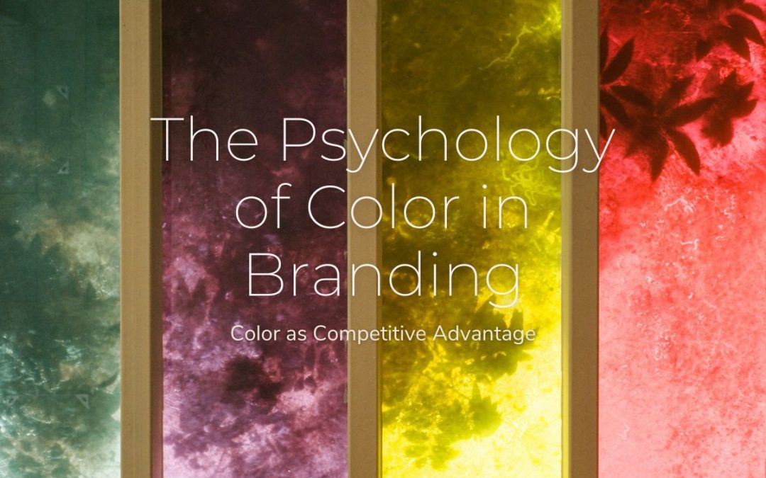
Three seconds. That’s all the time you have to make a first impression with your brand. And here’s what might surprise you: up to 90% of that initial judgment is based solely on color.
I learned this the hard way when I worked with a premium Greek olive oil company. They’d spent months perfecting their product, crafting their story, and refining their marketing message. But they chose a bright orange logo because “it felt energetic.”
The result? Customers subconsciously associated their premium product with cheap, mass-market brands. Sales were disappointing, and they couldn’t understand why.
The moment we shifted to a deep, sophisticated green with gold accents – colors that aligned with luxury, tradition, and natural quality – everything changed. Same product, same story, different colors. Sales tripled within six months.
This is the invisible power of color psychology in branding. It’s not just about looking pretty – it’s about speaking directly to your customer’s subconscious mind before they even read a single word.
The Science Behind Color Perception: Your Brain on Color
When you see a color, your brain doesn’t just process visual information – it triggers a complex cascade of psychological and physiological responses that happen in milliseconds.
Colors affect physiological responses; warm tones like red and yellow can increase heart rate and evoke feelings of excitement or urgency, while cool tones like blue and green tend to have calming effects.
Dr. Gerald Zaltman’s research at Harvard Business School found that 95% of purchase decisions happen in the subconscious mind. Color is one of the fastest routes to that subconscious, bypassing rational thought entirely.
Here’s what happens in your brain when you encounter a brand color:
Millisecond 1-50: Emotional Response Your limbic system immediately assigns emotional meaning to the color based on evolutionary programming and learned associations.
Millisecond 50-200: Memory Activation Your brain searches for stored memories and associations with that color, pulling from personal experiences and cultural conditioning.
Millisecond 200-500: Judgment Formation You form an initial impression of the brand’s personality, quality, and trustworthiness – all before consciously processing what the company actually does.
This isn’t just theory. Research shows that color can increase brand recognition by up to 80%, and 85% of customers identify color as a primary reason for choosing one brand over another.
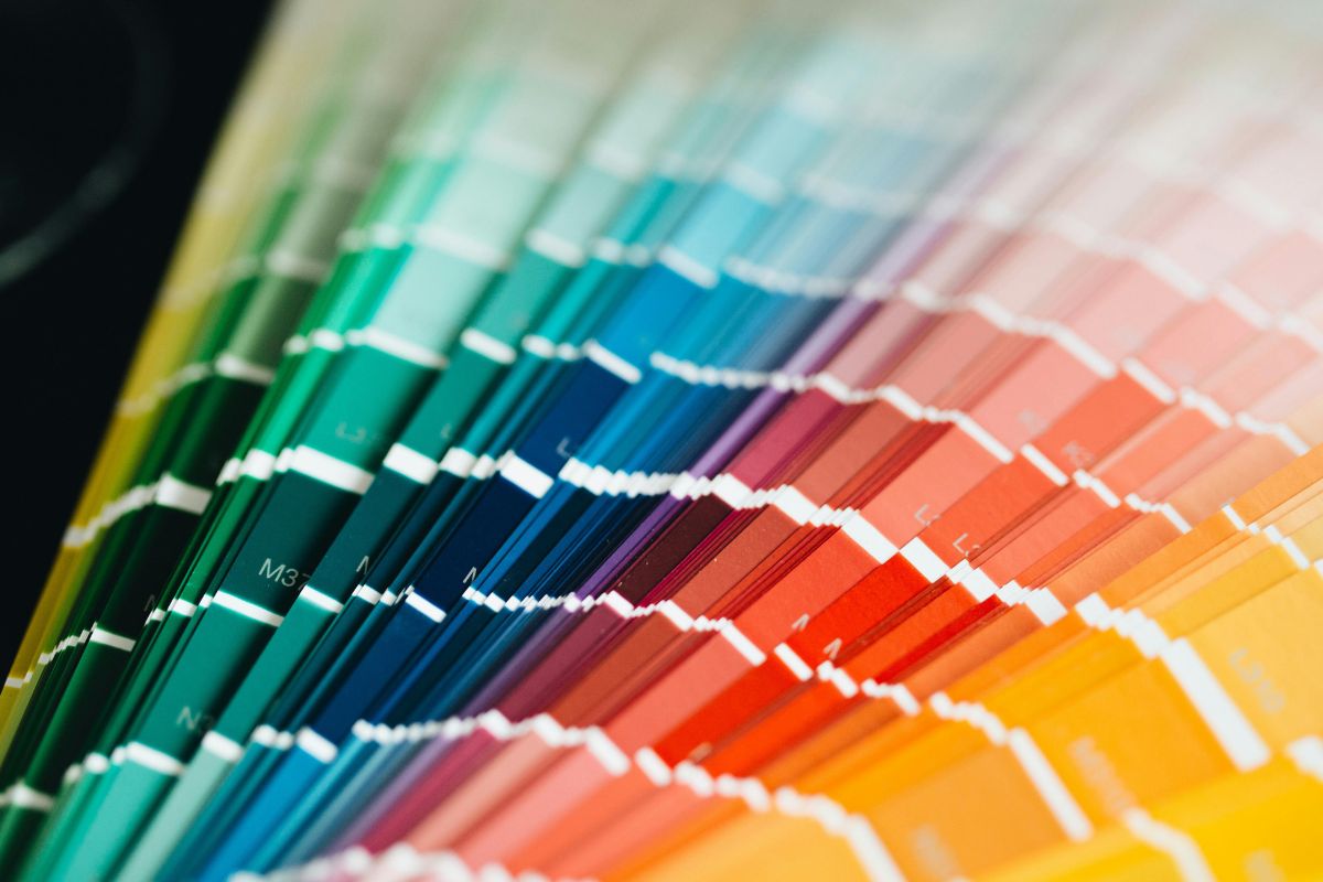
The Emotional Language of Colors: What Each Shade Really Communicates
Let me break down what your color choices are secretly telling your customers:
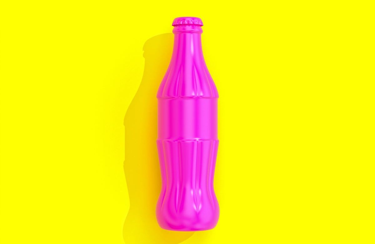
Red: The Urgency Creator
Red is the color of action, passion, and immediacy. It literally increases heart rate and creates a sense of urgency.
What Red Says About Your Brand:
- Bold and confident
- Energetic and youthful
- Urgent and action-oriented
- Sometimes aggressive or intense
When Red Works: Fast food (McDonald’s), emergency services, sales promotions, sports brands, entertainment When to Avoid Red: Luxury products, healthcare (except emergency), financial services requiring trust
Real Example: Coca-Cola’s red doesn’t just make you thirsty – it makes you feel energetic, social, and ready to “open happiness.” The color choice supports their brand positioning as the drink for good times and celebration.
Blue: The Trust Builder
Blue is known to be the most common ‘favorite color’ universally, and according to 54% of consumers, blue is the most trusted brand color.
What Blue Says About Your Brand:
- Trustworthy and reliable
- Professional and stable
- Calming and secure
- Sometimes cold or impersonal
When Blue Works: Financial services, healthcare, technology, insurance, professional services When to Avoid Blue: Food and restaurants (suppresses appetite), luxury goods, creative industries
Insider Tip: Blue is the go-to color for about 40% of Fortune 500 companies, which means it’s safe but potentially forgettable. Consider unique shades or combinations to stand out.
Green: The Growth Signal
Green connects to nature, growth, and renewal – but also wealth and prosperity.
What Green Says About Your Brand:
- Natural and healthy
- Growing and prosperous
- Fresh and renewable
- Sometimes associated with money/greed
When Green Works: Environmental brands, health and wellness, financial growth, organic products, outdoor activities Cultural Alert: Green brings up negative connotations in Indonesia, where it represents exorcism and infidelity, and in China, green can indicate infidelity.
Black: The Luxury Communicator
Black is the color of sophistication, premium quality, and exclusivity.
What Black Says About Your Brand:
- Luxurious and premium
- Sophisticated and elegant
- Powerful and authoritative
- Sometimes mysterious or intimidating
When Black Works: Luxury goods, high-end services, fashion, premium technology Cultural Consideration: Black is associated with mourning in many cultures, so context matters.
Yellow: The Optimism Booster
Yellow stimulates mental activity and evokes happiness, but it’s also the most psychologically powerful color.
What Yellow Says About Your Brand:
- Optimistic and cheerful
- Creative and innovative
- Energetic and attention-grabbing
- Can be overwhelming or cheap if overused
When Yellow Works: Children’s products, creative services, food (sparingly), innovation-focused brands When to Be Careful: In China, yellow is associated with pornography, and in Latin cultures, it can represent death and mourning.
Industry-Specific Color Trends: What Your Sector’s Palette Says
Different industries have gravitated toward specific color palettes for psychological reasons:
Technology & SaaS
Dominant Colors: Blue, white, gray Psychology: Trust, innovation, cleanliness, reliability Evolution: Moving toward more colorful palettes to humanize tech brands
Healthcare & Wellness
Dominant Colors: Blue, green, white Psychology: Trust, healing, cleanliness, growth Trend: Adding warm accents to appear more approachable
Finance & Banking
Dominant Colors: Blue, green, navy, gold Psychology: Trust, stability, growth, prestige Innovation: Fintech companies using brighter colors to appear more accessible
Food & Beverage
Dominant Colors: Red, orange, yellow, green Psychology: Appetite stimulation, natural freshness, energy Avoid: Blue (suppresses appetite naturally)
Luxury & Premium
Dominant Colors: Black, gold, deep purple, silver Psychology: Exclusivity, sophistication, premium quality Strategy: Limited color palettes to maintain exclusivity
Cultural Considerations: When Color Meaning Crosses Borders
This is where many global brands make expensive mistakes. Color meanings aren’t universal – they’re deeply cultural.
Color Meanings Across Cultures:
White:
- Western: Purity, weddings, cleanliness
- Asian cultures: Death, mourning, humility
Red:
- Western: Love, passion, energy
- Chinese: Luck, prosperity, celebration
- Turkey & Most African countries: Death and mourning
Purple:
- Western: Luxury, creativity, royalty
- Catholic Europe: Death and crucifixion (Disney had to redesign their European campaigns)
Green:
- Western: Nature, growth, money
- Indonesia: Forbidden color, exorcism, infidelity
- Many African cultures: Wealth and fertility
Smart Global Color Strategy:
- Research First: Understand color associations in each target market
- Test Locally: Use A/B testing with local audiences before full rollout
- Adapt Intelligently: Develop “color flexibility” – adapt color implementations while maintaining brand recognition
- Consider Context: McDonald’s customizes its sites to reflect color preferences of each country while maintaining signature red
How to Choose Colors That Convert: A Strategic Framework
Here’s my proven system for selecting brand colors that actually drive business results:
Step 1: Define Your Brand Personality
Before touching any colors, get crystal clear on your brand’s personality. Are you:
- Professional or playful?
- Traditional or innovative?
- Accessible or exclusive?
- Energetic or calming?
Step 2: Know Your Audience Psychology
Research your target demographic’s color preferences:
- Age groups: Younger audiences prefer brighter colors; older audiences prefer subdued tones
- Gender considerations: Men are more likely to be color blind, affecting their perception
- Cultural background: Research cultural color meanings in your market
- Industry expectations: Understand category norms and when to break them
Step 3: Audit Your Competition
Map your competitors’ color strategies:
- What colors dominate your industry?
- Where are the gaps you could own?
- How can you differentiate while staying appropriate?
Step 4: Apply Color Psychology Strategically
For Trust-Based Businesses: Lead with blue, support with green or gray For Energy/Action Brands: Lead with red or orange, support with yellow accents
For Premium/Luxury: Lead with black, support with gold or silver For Health/Natural: Lead with green, support with blue or earth tones
Step 5: Test and Optimize
A red call-to-action button has been shown to increase conversion rates by 34%, but this doesn’t mean red works for everyone. Test different color combinations with your actual audience.
Case Studies: Color Psychology Success Stories
Case Study 1: The Bank That Chose Orange
ING Bank broke financial industry conventions by choosing orange as their primary color. While competitors stuck with traditional blue, ING’s orange conveyed:
- Warmth and approachability
- Innovation and forward-thinking
- Energy and optimism
Result: ING became one of the most recognizable banks globally and positioned itself as the “different” bank.
Case Study 2: The Food Brand That Avoided Red
Whole Foods chose green and earth tones instead of the typical food industry reds and yellows. This positioned them as:
- Natural and organic
- Healthy and fresh
- Premium and conscious
Result: They owned the “healthy food” space visually before competitors caught on.
Case Study 3: The Tech Company That Embraced Humanity
Slack chose a multi-color palette instead of typical tech blues. Their rainbow approach communicated:
- Diversity and inclusion
- Creativity and fun
- Human connection over cold technology
Result: They differentiated from enterprise software competitors and built a more approachable brand.

The Future of Color in Branding: 2025 Trends and Beyond
36% of consumers predict that both AI-generated futuristic tones and earthy, organic color palettes will dominate branding trends in 2025. Three in 10 want brands to use adaptive “living color palettes” that shift website or app colors based on users’ moods or preferences.
Emerging Trends:
Dynamic Color Systems: Brands will use AI to adjust colors based on user behavior, time of day, or emotional state
Sustainable Color Stories: Colors that tell environmental stories and connect to sustainability values
Inclusive Color Design: Consideration for color blindness and cultural inclusivity from the start
Personalized Brand Colors: Technology allowing users to customize brand color experiences
Nostalgia-Core Palettes: Muted browns, sage greens, and terracottas reflecting growing interest in natural authenticity
Common Color Psychology Mistakes That Kill Conversions
Mistake 1: Following Trends Over Strategy
The Problem: Choosing colors because they’re “on-trend” rather than strategic The Solution: Always start with your brand strategy and audience psychology
Mistake 2: Ignoring Cultural Context
The Problem: Using Western color psychology globally without research The Solution: Research color meanings in each target market
Mistake 3: Too Many Colors
The Problem: Using more colors than necessary, creating confusion The Solution: 95% of top brands use just one or two colors in their logos
Mistake 4: Color Without Context
The Problem: Thinking color works in isolation The Solution: Research shows that context is far more important than individual color meanings
Mistake 5: Not Testing Color Impact
The Problem: Assuming color preferences based on personal taste The Solution: Test color variations with your actual target audience
Color as Competitive Advantage
Color psychology isn’t just about making your brand look good – it’s about creating an unconscious connection with your audience that drives business results.
When you get color right:
- Brand recognition increases by up to 80%
- Color ads outperform black-and-white ones by 42% in viewer attention
- Customer trust and loyalty improve measurably
- Premium pricing becomes easier to justify
- Cultural barriers decrease in global markets
But here’s the key insight: successful color psychology isn’t about following rigid rules. It’s about understanding the emotional language of color and using it strategically to support your brand story and business goals.
The brands that master this invisible language of color won’t just look different – they’ll be remembered differently, trusted differently, and chosen differently.
Your color palette isn’t decoration. It’s communication. Make sure it’s saying what you want it to say.
Your Brand's Color Psychology is Either Making You Money or Costing You Money. Which Is It?
While you’re choosing colors based on what “looks nice,” they’re using proven psychological triggers that increase brand recognition by 80% and boost conversions by 34%.
Transform your brand from forgettable to unforgettable with the psychology of color.

Afroditi Arampatzi
Marketeer
Hi, I’m Afroditi.
I’m the founder of Sustainable Growth, a Thessaloniki-based consultancy specializing in performance marketing and brand strategy.
I help businesses strengthen their brand positioning and apply AI-driven solutions that support smarter marketing, better decision-making, and sustainable growth.
