Raptaki Labs
Medical Laboratory Rebranding
- Graphic Design
- ROOM 702 Agency
- Web Development
- Category
- Healthcare Branding
- Start Date
- 2024

A medical lab that doesn't look like every other medical lab
When you picture a diagnostic laboratory, you picture the same thing everyone else does: white walls, fluorescent lighting, a logo with a DNA helix, a name in blue or green. Clinical correctness used as a substitute for brand identity.
Raptaki Labs had three locations, real clinical reputation, and ISO certification. What it didn’t have was a single visual or verbal reason someone would remember it after walking out the door. That was the project: build a brand that earns trust the way medical brands have to — and looks like itself while doing it.
The Challenge
Raptaki Labs didn’t have a bad brand. It had no brand.
Three locations, ISO certification, a clinical reputation that brought patients through the door on its own — and an identity that any other diagnostic lab in Greece could have used without anyone noticing the difference. DNA helix, microscope, blue-green palette. The category checklist, executed correctly.
That’s the harder version of a rebrand. There’s nothing to fix. There’s something to build.
What had to hold:
> Clinical credibility — non-negotiable in healthcare
> Coherence across three locations, signage, uniforms, print, web
> Recognition at every scale — reception wall to Google result
What had to go: Every visual cliché the category defaults to
The original logo featured a circular DNA helix framing a microscope, visual shorthand that immediately communicated “medical laboratory.”
While technically accurate, the design relied on generic scientific imagery that could belong to any of thousands of diagnostic facilities worldwide.
The blue-green color palette, though appropriate for healthcare, did nothing to distinguish Raptaki Labs from competitors.
The Transformation
The Solution
New Visual Identity
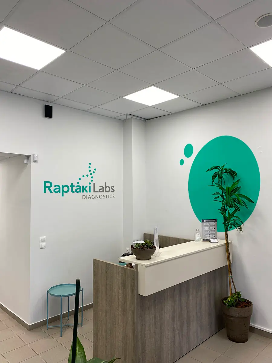
The new “Raptaki” wordmark strips away generic symbolism in favor of confident typography. The teal color sits at the intersection of blue (trust, healthcare) and green (health, vitality), distinctive yet appropriate for healthcare.
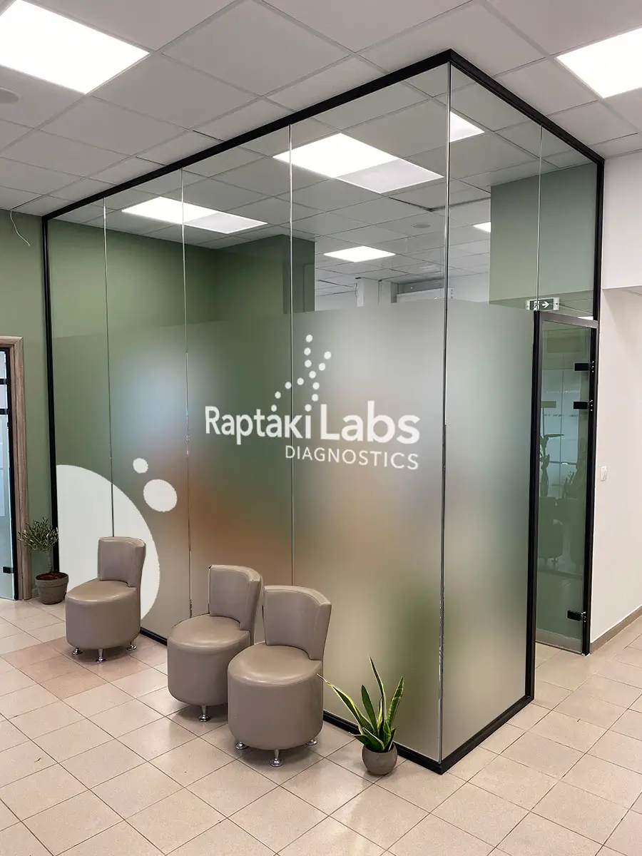
Interior Transformation
Complete interior experience design across all three locations. Environmental graphics, wayfinding systems, and branded touchpoints that reduce patient anxiety and reinforce brand personality.
Environmental Graphics
The brand identity extends from reception walls to directional signage. Window decals, interior signage, every element reinforces the new personality: professional but approachable.
Digital Presence
Complete website redesign that reflects the updated visual identity, simplifies the patient journey, and builds trust through transparent information.
What Makes This Rebrand Different
Most medical facility rebrands stop at making things look “more modern.” We approached Raptaki Labs as a complete brand experience problem:
Before the visit:
How does someone discover and choose this lab over competitors? What does the website communicate?
During the visit:
What’s the first impression when walking in? How does the physical environment affect patient anxiety?
After the visit:
How are results communicated? Does the brand stay in mind for the next time diagnostic services are needed?
Every touchpoint got attention. Every element was designed with intention.
Project Scope
- Brand Strategy
- Logo Design
- Visual Identity System
- Color System
- Typography
- Interior Design
- Environmental Graphics
- Signage System
- Window Graphics
- Wayfinding Design
- Staff Uniforms
- Website Design
Let’s Get in touch
Navigate
Let's Work
Newsletter
Get valuable marketing insights, growth strategies, and brand positioning tips straight to your inbox.
By signing up to receive emails from Afroditi Arampatzi, you agree to our Privacy Policy. We treat your info responsibly. Unsubscribe anytime.
© 2010—2025 Afroditi Arampatzi – Privacy Policy
Code By – FyndAgency